Creating Image Sliders and Galleries
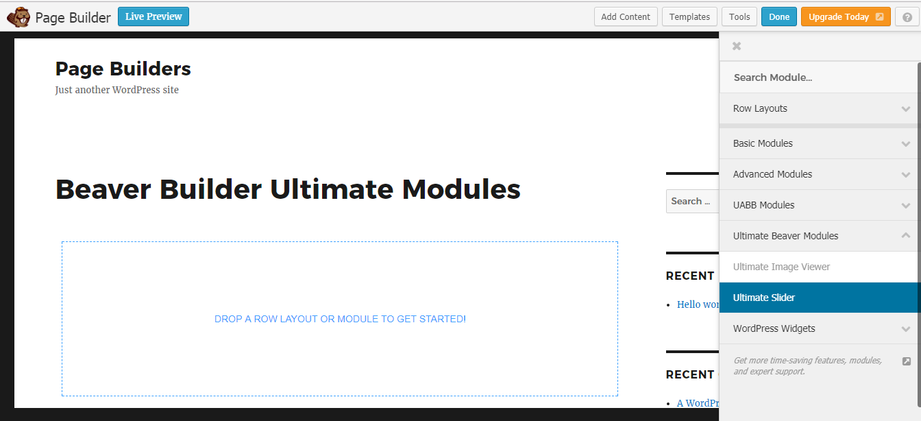
Once Ultimate Modules Pro – Beaver Builder plugin is installed on your site, you will get a new element in Beaver Builder called Image Slider in a new category called Ultimate Media as shown in the following screenshot.

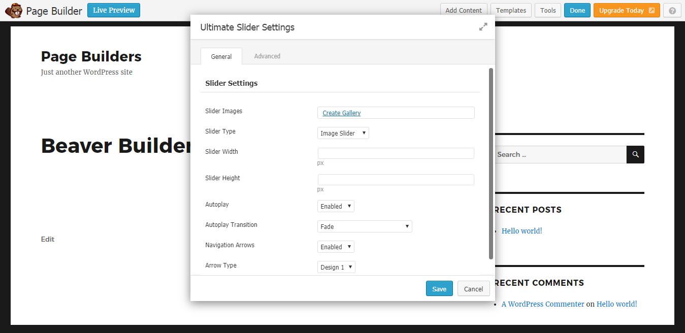
You can drag the element into the Beaver page builder to create a slider or gallery. Once Image Slider element is created, you will have a screen similar to the following.

Use the Add Images button to upload the slider/gallery images through the media uploader. Then you can adjust the settings of the slider in popup and preview will be changed accordingly. Let’s identify the available settings.
- Slider Type – This setting defines the type of slider/gallery. You have the option to choose normal image slider/gallery along with logo sliders, tab sliders and vertical sliders.
- Slider Width – This setting is set to set the default width of image slider, By default it will be set to 600px. You can adjust it according to your theme. It will become responsive for small screen sizes.
- Slider Height – This setting is set to set the default height of image slider, By default it will be set to 300px. You can adjust it according to your theme. It will become responsive for small screen sizes.
- Autoplay Transition – This setting defines the transition type for slider. By default its set to Fade. 10 transition types are available at this stage. Please note that this effect is available only on auto play mode. Its not available when you use manual sliding with arrows.
- Autoplay – This setting is Enabled by default and slider plays automatically by default. You can set it to Disabledto hide the prevent automatic sliding.
- Navigation Arrows – This setting is Enabled by default and arrows for manual navigation is displayed. You can set it to Disabled to hide arrows for navigation.
- Arrow Type – This setting is used to define the Skin for navigation arrows.
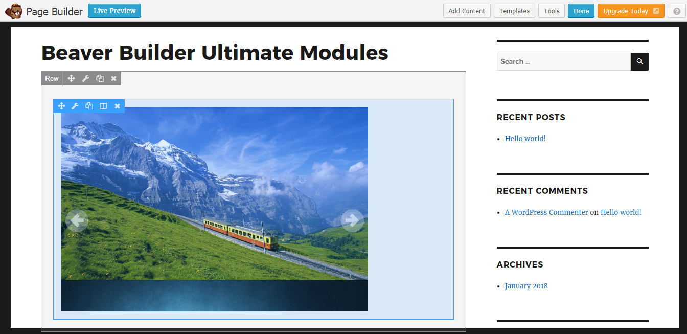
Once element is saved, you will see the slider/gallery on frontend as shown in the following screenshot.

